
Bryan Eisenberg
Bryan Eisenberg is the co-founder of BuyerLegends, an internationally recognized authority and pioneer in online marketing, improving conversion rates, and helping organizations improve their customer experiences. Bryan has been recognized by eConsultancy members as one of the Top 10 User Experience Gurus, by LinkedIn as a Retail Influencer and he is also an IBM Futurist.
Converting traffic is all about curiosity, hence the secrets. When I first started thinking about conversion, and this goes back way, way back, I was in school for social work and my brother pulled me out to do business with him. And we started getting into a sales and marketing training business. By the way, we started online. This is in the early 90’s, okay?

So much of what is going to be covered in this talk didn’t even exist yet, when we started. When Amazon first started, of course we started hearing buzz about them when they started raising their capital and all of that.
We were really curious about how they were going to be successful. And we were not huge fans of them at all. Funny coming from a guy who 20 years later wrote the book “Be Like Amazon.”
When we first got started in this industry, we were both curious about why do people do the things they do. And that led us to experiment, to test, to ask questions, to watch others. And to understand how this technology, the Internet, was going to change people’s behavior.
Throughout this talk there are going to be a lot of examples, some of them old, some of them new – either way, all the principles are going to apply, no matter what. Before you get hung up about the idea of “studying” all the different examples, don’t go crazy. Just find the ones, say, “Hey! That’s the one I could latch onto right now.” And at the end, I’m going to give you bullet points of five things that you can do to kind of sum it all up.
Before we start talking about the things that great websites do to convert site visitors into people who take action, we need to make sure that we understand what that means. Conversion rate is a measure of your ability to persuade visitors to take the action you want them to take. It’s a reflection of your effectiveness and customer satisfaction. In 2001, when I first started writing for Clicksy back in the day, this idea was kind of sacrilegious. People didn’t believe it, right? This is back when people were still thinking of sock puppets being successful. It was all about traffic, it was all about eyeballs, the new economy. And I said, “For you to accomplish your goals, your visitors must accomplish your goals first.”
I want to talk about Amazon as a start because they are doing things that is putting them way ahead of the game in terms of conversions. The top 25% of online retailers convert at 5%. Top 10% convert about 11%. But here’s where it starts getting interesting, Amazon non-Prime members convert at 13%.
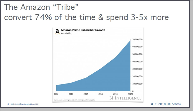
It wasn’t always the case because remember, at one point, Amazon was a start-up, just like a lot of you. And look at where they’ve come to. Where today, Amazon Prime members convert at 74%. For those of you who are not good at math, that’s a lot more than non-Prime members, right? And here’s the crazy thing: They say that over 50% of households now are Prime members.
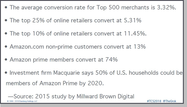
Let’s put these numbers in perspective. When you start looking at average conversion rate numbers, the average conversion rate for the top 500 merchants is 3.32%. In 1998 when the first published benchmark of
conversion rates came out from Shop.org, it was 1.8%. And 10 years later, it had gone up to 2.1%. Now these are the top companies.
Now think about it. In the last 20 years,are websites technology better than they were 20 years ago? Are they better designed? Do people trust buying online? Do we have better bandwidth? Better tools? Better analytics?
So why aren’t conversion rates really skyrocketing with all this advancement? Well, hopefully I’ll be able to answer that for you by the end of this.
Secret #1 – They Compete on Values, Not Value
So how did Amazon get to where they got to? First, it’s because Jeff Bezos understood that you need to compete on values, not value. Walmart always wanted to be the lowest priced competitor. He knows he can beat the lowest, most competitive price. But that’s not what Amazon’s brand was built on.
When you think of brand ‘Amazon’, what do you think of? Yes, fair price, huge selection, greatest selection of anybody else out there. How fast are
you going to get it, right? Quick availability, and, of course, if anything goes wrong, it’s going to be hassle-free. That’s how he built his brand. And that’s why Amazon’s growth is so incredible, where they convert 22 times better than the average website.
Now think about it, is their design 22 times better? Nope. Are their analytics 22 times better? Do you think they have teams that are 22 times smarter than the folks here in this room? So how did it get there? That’s the value of building a great brand built on the values.
Now here’s the thing, it also helps you explain why there’s some websites that sill convert pretty well, but actually suck. By the way, I’m from Brooklyn, so that’s a technical term. It’s not to offend anybody.
Here’s the thing, how many of you have heard of Macy’s? It still converts well among a certain part of the audience. But what’s the problem that Macy’s has? The audience that shops Macy’s is dead or dying (aka – the older generation). Sad, but it’s true! They just lost a big conversion there. But that’s what happens.
So even today we’re seeing this in search results as well. The number one, top ranking factor in Google today is direct website visits. What’s a direct
website visit? Someone heard of your brand. It increases click-throughs and increases conversion. So, the first thing to make sure you get great conversion it to build a great brand.
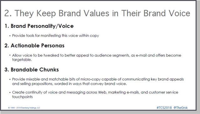
Secret #2 – They Keep Brand Values in Their Brand Voice
The second thing Amazon does is they keep brand values in their brand voice. They’re consistent in every communication they have. They have a personality, they express them. They understand their personas. They use personas as a way to gauge how they communicate with people. And they have what’s call brandable chunks – a way to communicate.
Here’s an example where we created the brand guide for the folks at Chubbies. I just love the web copy that these guys have. So, here’s an example from an email. “Konitiwa Chubchacos. I’m Brian Bowers, the new mother-friggin’ CEO of The Chubbies Weekend. You’re thinking, “Brian Bowers, why the heck would you wanna be the CEO of the world’s handsomest, smartest, and most humble Friday email when you could easily just be living out the life of a functioning derelict?”
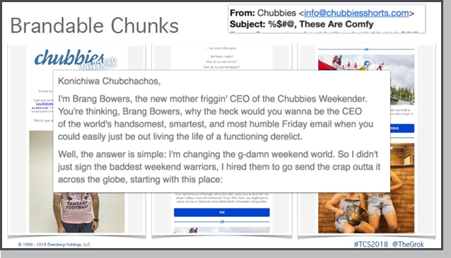
Now if your emails don’t have a voice like that. That’s strong, that’s so clear, it’s very hard to compete.
Secret #3 – They Obsess to Understand Customers
Number three, they obsess over understanding their customers. In 2001, we wrote our first book called “Persuasive Online Copywriting.” In that book, we started talking about the four basic temperaments. Four ways that the brain has operated since the time of Aristotle. All the way from Jung, and Myers-Briggs, this has been consistent.
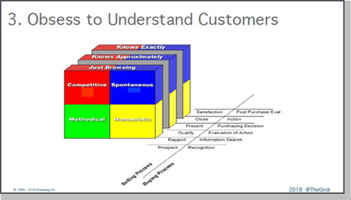
There’s a logical side of the brain, and emotional side of the brain. There’s a brain that processes things quickly, and a brain that processes things
a little bit more slowly. And these temperaments drive the way people gather information, and the way they make decisions. When you can start understanding that, and how it syncs up, you can get your selling process aligned with their buying process. Now you can start to have success.
This was probably in 1999/2000, Jakob Nielsen, the usability guru, did an eye-tracking study. And he magically found that there were four types of people who looked at a website. Imagine that. Four types.
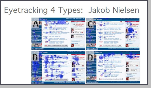
Now, this is the U.S. Census Bureau website. You don’t have to be a psychological expert to understand that one of the personality types, the most methodical personality type, is the type who spends a lot of time looking at every single detail. Staring at everything, becoming expert at the page. Image B represents the methodical type.
We use these principles to start with developing our personas. By the way, obsessing over people is also understanding that they may not do the things that you expect them to do. Here’s a simple little eye tracking example, to tie this concept together.
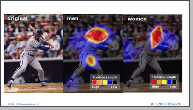
The image above shows where people focus their attention the most when that batter comes up to the mound. When women look at baseball, this is what they stare at. And then when men look at baseball, you kind of get that effect. Do not make assumptions!
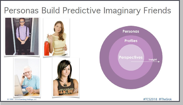
It’s almost like your personas become your imaginary friends. They help get you started in understanding how to have that conversation. How to build a community of people just like your personas? We start when we build our personas, with those perspectives. You can’t take your own perspective because your job is to sell. And you’re in your business of thinking about your business 24/7, they’re not.
To do this, you start from their perspective of knowing nothing. Step out of that bottle, and you start with that perspective. And as you add more data, and more experiments, and more tests, you develop more insight. And you build these out into profiles and personas. You have to build these imaginary friends. They’re going to help you write your content, plan your marketing, plan your journeys, all of that.
Secret #4 – They Maintain Scent
Number four, they maintain scent. By scent, what I mean is something that keeps their attention, in a consistent way to avoid distractions and “mental disrupts.” Below is probably one of the best examples I’ve ever seen. First of all, it shows you how Victoria’s Secret does this by talent, not by process.
Once you see the process of this, you’re never going to miss it.
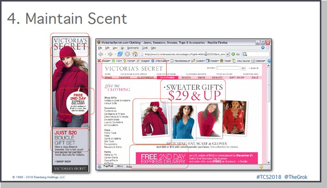
Here’s Victoria Secret’s banner and the landing page. I am not a fashion expert. But here’s what I do know – you see that the logos are obviously the same. You see the imagery, they’re not identical. And that’s done on purpose. Why don’t we use identical imagery? Because when it’s identical it gets boring. So, something to kind of snap you into it, and the product, obviously, is what stands out.
But here’s the thing, free second-day delivery on top, free second-delivery on the landing page. What the difference between the two? One’s in pink and white, the other one’s in black and red. The brain connects these things.
Those don’t seem to be connected instantly.
And then, here’s the shocker. This is the part that’s really the worst part of it. On the banner, they’re talking about Bouclé gift sets, and on top they talk about sweater gifts. Now, I don’t know what a Bouclé is, but I’m obviously not the target market. But I do know that 20 dollars is not 29 dollars. Can we all agree on that? So that’s why it’s broken, this tiny little piece. Now, if you went ahead and you clicked on the image of that same product, they take you to category page and you’d repeat the process all the way through.
Despite the pricing mistake, this is good scent.
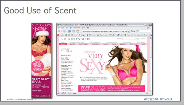
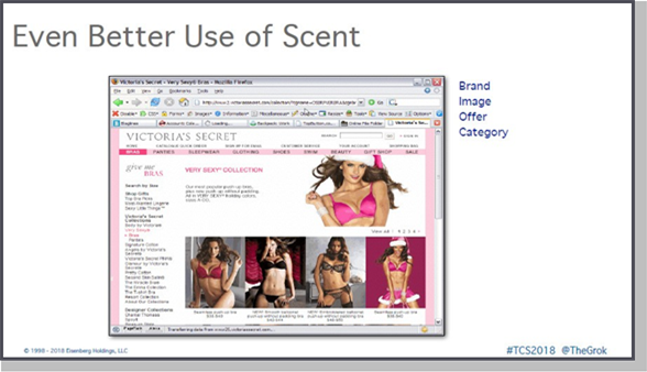
Now let me show you another example where they absolutely got it 100% right, just to compare it. So, here’s the banner ad, here’s the landing page. Obviously, the logos have similar imagery, the very sexy offer, and then the pink and white. And then, of course, as you clicked in further you got the exact same thing. This is the use of scent. Brand, image, offer, category. You want to keep those consistent.
Now let me give you some examples of what you can use to create scent. There’s a concept on the web called the “Move Forward Until Found”rule. A 1995 study by the Xerox Palo Alto Research Center found that humans are information foraging animals. That we’re just on a hunt for things, and we do it much like animals hunt for food.
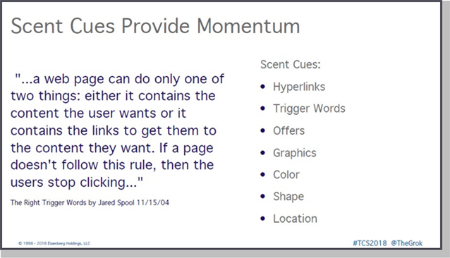
We’re trying to track down the information we want like a bloodhound.
Or more like a beagle – the most intelligent creatures, but they lose track very quickly because they catch scents of things. That’s your online visitor. They get distracted very easily. So you have to give them the scent non-stop. Just like you’d give the dog meat all the time. Scent ques include hyperlinks, trigger words, brandable chunks, offers, graphic, color, shape, location. Don’t change these things, so that they can keep following through.
Secret #5 – They Understand Customer Buying Process
Five, great websites understand the customer buying process. They spend so much time detailing and understanding those personas. They understand the questions that they have about how they buy. I remember when we first started sending out our newsletter, Grock.com. I don’t know if anybody was here long enough to remember Grock.com’s newsletter. I used to hand code
our mailer, because there were no ESPs. And I remember seeing all the Lands’ Ends emails on there.
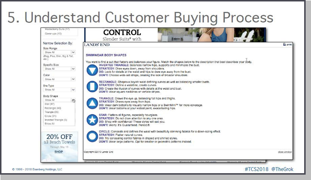
But here’s the cool thing. You get to their page and they have all these different body types. Some of them, obviously, I recognize. But some of them I didn’t. For example, the star body type. And they go an explain each one. Just so you can kind of find the right mix. And this is, again, just taking the time to understand how your customers need to buy. Not how you want to sell them.
This has been Jeff Bazo’s approach for Amazon from day one as well. When he told publishers that he wanted to put up reviews they all said, “No, no, no! You can’t put up reviews, they won’t convert. It’s stop sales.” And he said, “No, you don’t understand. We’re not in the business of selling books, we’re in the business of helping customers buy books.” That’s your job, also. You have to help your customers buy – by understanding the buying process.
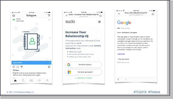
Here’s an example from Instagram, one of my favorite ones. I went ahead, I found this ad for lightweight CRM called Sudo. Now, there’s the ad. I go click on the landing page. It tells you, “Hey go try this with Google, or with Outlook.” So, of course, I use Google. What do you think is supposed to happen when I click on “TRY WITH GOOGLE”? I should be able to sign up. But what’d I tell you? I was inside the Instagram app. What happened instead? That’s not understanding the context or process of the way I’m going to purchase.
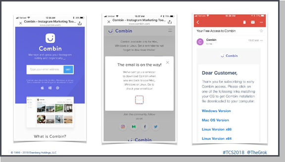
As a contrast to that, the same day I came across this example from Combin. You can sign up, and they tell you, “Hey, Combin is only available for Mac, Windows, or Linux. So why don’t you give us your email address, so we can send you an email where you can download it when you get on your computer.” That’s what social is great for. Not necessarily for doing everything, but for doing it later on. They did a wonderful job at acknowledging my email. “The email’s on the way,” and then they send
me the email right afterward. Great example of understanding the buying process.
Secret #6 – They Plan the Complete Journey
Number six, they plan the complete journey. Geico provides a good example of great scent from an ad to a landing page. The banner is well done. Geico makes it easy. Just click here. Geico could save you hundreds on your car insurance.

Would you like cream or sugar that? Obviously, you see the Geico logo. Just fill in your zip code, name, start the quote. Everything’s in green, so there all the similarities. Of course, this is owned by the marketing team. I think they did a wonderful job with this.
But now you go in, you put in your zip code, and you get to a page that looks like this.
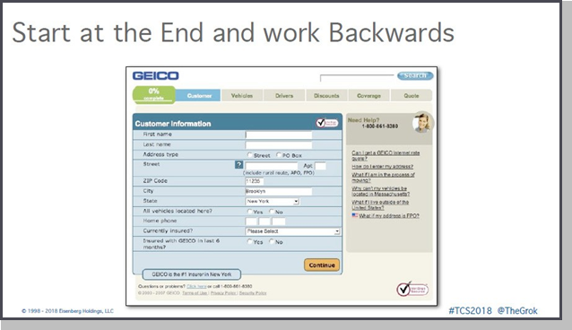
This page looks totally different and that’s “broken scent.” That “stinks,” is a better word for it. They could have done so much more here, but it completely fell apart in the experience. By the way, on other page, everything was in green, so your eyes are naturally drawn to the green, right? What’s the first thing you see on the page? The green box at the top that says 0%.
Ok, you don’t need to be a math expert to figure this out. But if the form already has my zip code, city, and state I know it can’t be zero. This may seem like we are nit-picking, but things like this have an impact. If they were to start it from the back and work forwards, it would have made sense. Who owns this part of the process? It’s called BPU – Business Prevention Unit.
Some of you call it IT. It’s as if there was no strategic planning when the two pieces of the site were put together. Bottom line, you need to maintain continuity throughout the customer experience, or journey.
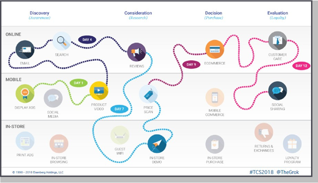
Today’s journey is way, way, way, way, way complicated. So, you really need to plan it all out. Here’s another great example. Found this ad, how many of you have seen these ads for Harry’s Razors all over the place? Yeah, they’re targeting everybody lately. Radio ads, TV ads, Facebook, Instagram.
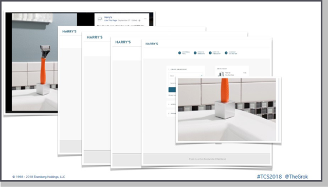
So, here’s this wonderful ad, I see it. They talk about the great prices, all of that. And you start clicking through, you get to the landing page. There we go. You see the nice orange razor, everything’s going great. Then they
tell you, okay pick which color razor you want. So, I actually like the orange one. They ask, “How often do you shave?” You click on that. Again, a nice clean consistent experience. You keep going through. “Any accessories you want with that?” Wonderful.
Now, they take you to the checkout process. Now you’ve got the little image there, but there’s only one problem throughout the whole process. And I know I’m not the only one who feels this way. What caught my attention in the ad?
That little holder! All I want it that little cube! And they never offered it. I would have paid double just to have the cube, because that looks cool. But what happened? Some ad photographer said, “Hey, you know what? We should have it standing up on something ‘cause it would look much better.” And then they never thought about what the experience would look like. But YOU have to!
Secret #7 – They Remove Friction and Overcome Objections
Number seven, top converting websites remove friction and overcome objections. This is one of my favorite check-out processes out in the web. We were dealing with Frames Direct, and we’re trying to help them do this. And we’ve been fixing check-out processes for so many years it’s kind of scary.
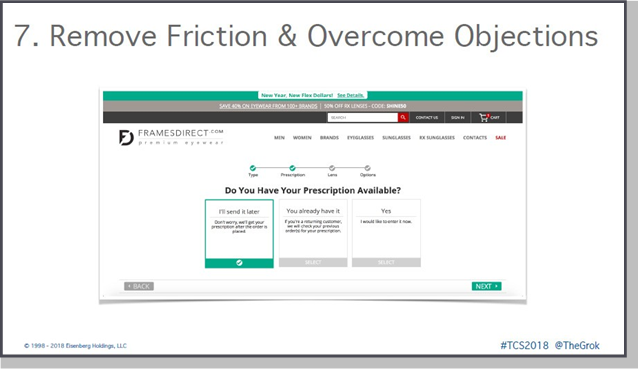
But, if you’ve ever bought glasses online, one of the biggest things that stops people from purchasing is the fact that they may not have their prescription ready at the time they are at the computer. So, all we had to do was tell people, “Hey, no problem, you can still buy the glasses. And you could send us the prescription later.” This made it seamless throughout the whole experience.
Now think about that. Buy whatever glasses you want, and what did I do first? It’s an old sales principle called GTC. You know what that is? Get The Cash. Because once I have their money, if the prescription doesn’t match the glasses, I’ll fix it on the phone later on. But I already have their money. And even if it’s a difference of a few dollars it’ll take care of itself, simple. Check them out on mobile as well, they did a great job on it.
Secret #8 – They Provide Point-of-Action Assurances
Number eight, they provide point of action assurances. Top converting websites have lots of little places where they use microcopy to reassure people when they’re not ready to convert. Look at the example below from Zendesk.
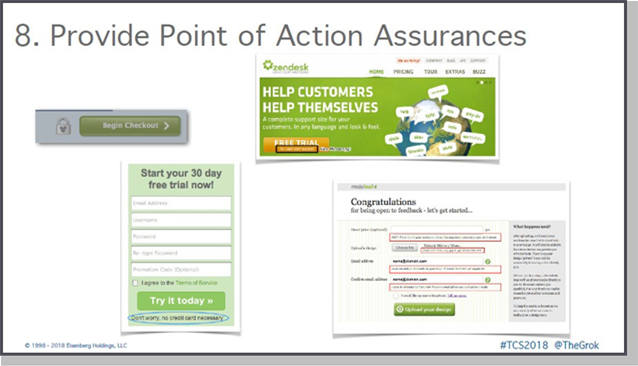
So, we value your privacy. All these little lines on there. But one of my favorites of all times is the one from Disney. When you go to their check out buttons they have the little lock with the Mickey ears. That’s branding. That’s all their trust in one spot to get you to click on it. That’s the power of a brand tied into a point of action assurance. Tied into microcopy and a brandable chunk. This all flows one into another.
More examples of how you can do this in check-out: let them know when shipping, how fast, the guarantee options, all the details that privacy is safe, all of those. You can see them in all kinds of sites that I’ve done them on.
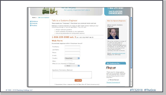
This is also B2B example, which may or not work for you, depending upon what industry you’re in. When people fill out the web forms it says, “Hey you’re not ready to do a web form? This is the actual engineer that you can either email or phone call.” And this skyrocketed conversions.
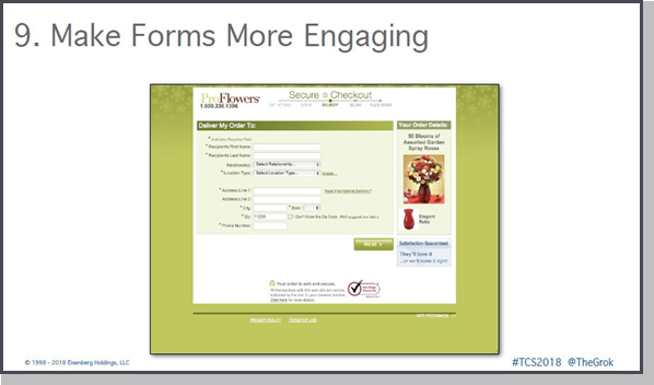
Secret #9 – They Make Forms More Engaging
Number nine, if your forms look like they belong to the Department of Motor Vehicles, you will not convert very well. Make them more engaging. There’s not a lot of ways that you can do them, but you can add color to them, you could add images to them.
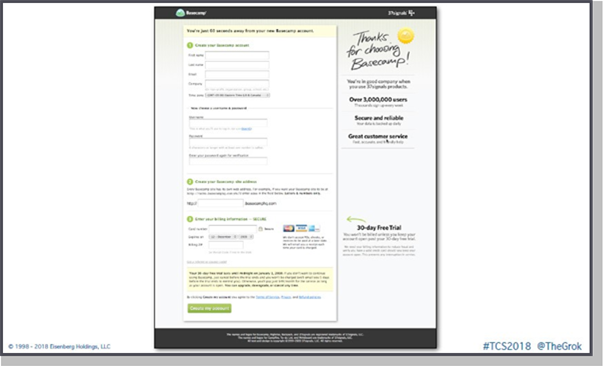
Probably my favorite of all time is this old one from Basecamp where they add in the little arrow with the 30-day free trial. How they chunk up the different pieces of information – the “Thanks for choosing”and reminding people with a point of action assurance are the benefits of why people have chosen them. Again, a great example of how to do that.
Back in 2006 when we wrote “Call to Action,” we actually gave people exactly what and how we thought about redesigning Café Press’ checkout where we brought them down from like a 60% abandonment rate down to a 15% abandonment.
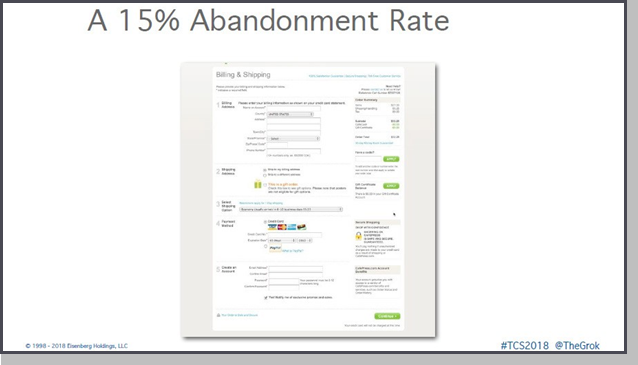
By the way, the average abandonment still on the web is around 70%. By the way, in all the years since we’ve published that book, they are still using pretty much the same exact check-out because these principals work. Go rip them off.
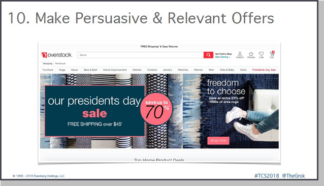
Secret #10 – They Make Persuasive and Relevant Offers
Number 10, great converting websites make persuasive and relevant offers. If you know your personas, you know what’s going to motivate them. And of course, you’re going to have to keep those offers showing up everywhere, all along the process. In this example from Overstock, you can see the offer loud and clear on the home page.
When you go to the category page, it’s still there loud and clear at the top. On the product pages, it’s there, but smaller and less visible in a line just under the navigation. But look what happens when you get to the cart and check-out page.
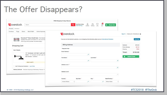
The offer is not there anymore, as if it disappeared. And if people don’t see the offer, they forget about it. Or, worse yet, if they to remember, it could have been the very offer that was going to be the thing that was going to “push the sale.”
Usability testing studies show that people literally forget what they saw from one screen to the next. All of a sudden, they’re like, “Did I qualify for the offer? Did I do something wrong? Do I have to do something special? Do I have to put in a code?” And they’re gone. Don’t let that happen. You need to keep them through this whole process.
Secret #11 – They Look at Things from Different Perspectives
Number 11, top converting websites understand they need a different perspective on things sometimes. You have to think beyond traffic. This is not a numbers game, we’re dealing with people. We’ve been dealing with trying to get to understand customers and have real conversations.
And so you can’t be doing things where you drive traffic like this.
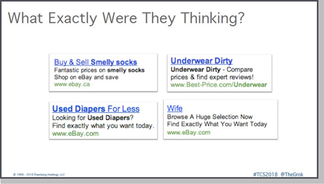
These are actual, in the wild, screen captured ads. If you go, and you ask my friend Mark Roberge, from Acquisio (a company who are experts at enabling digital marketers to optimize their search campaigns), he’s seen many of these over the years with me, as well. Yeah, some of them are pretty bad. I didn’t know you can get a wife on eBay.
This practice is so prevalent that I actually coined a word for it – Crackvertising.
– Mash-up of the words Crack + Advertising. The addiction to and/or business dependency on low cost traffic from Google search and other search advertising.
Here’s the thing about optimization – when people think about it, it’s not just about driving traffic. And it’s not just about a landing page, and creating landing pages, and A/B, and multi-variable testing. It’s not what it’s about, it’s not optimizing one page. Optimization, really, is a way of thinking. It’s a way of approaching everything you do from the board room to the stock room, you’re always trying to improve things.
Because when most people think about their optimization process in their business today, they really think they have this really cool looking sports car.
But in all honesty, you know what they have? It’s the Miata with the helmet. So, seriously, you have to constantly be testing.
How many of you are testing more than 100 things a year? How many of you are testing more than 500 a year? More than 1000? And we’ve got maybe two hands up. Jeff Bezos, in his letter to shareholders, talked about how last year they did over 1,976 experiments. That’s a culture. That’s the way you’re thinking, that you always need to be experimenting. And the reason you do this is because you’re curious about your customers. You’re trying to find way to improve their lives to innovate on their behalf.
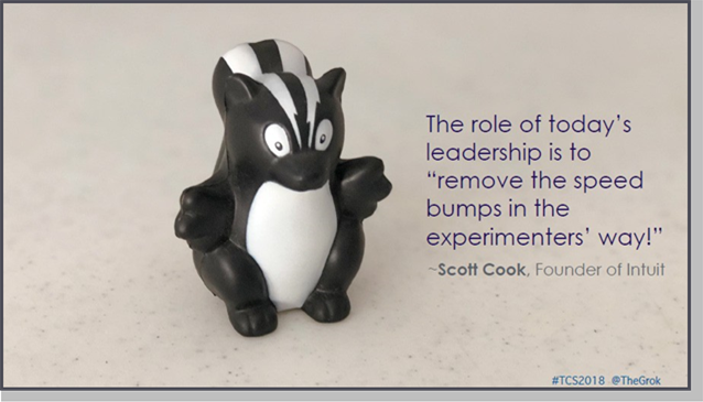
You need to create cultures. Like Intuit, who has a program where they award people for just coming up with ideas, whether they win or lose. Everybody in their organization gets pride in owning what the company calls a “stinky.” And the great organizations, they’re testing more than the average company is in a month. They have a structured approach to testing, I’m going to give you one in a couple of minutes.
Secret #12 – They Use a Variety of Methods
Number 12, they use a variety of methods. They understand that optimization is more than just this landing pages and stuff like that. They need to go beyond just the simple usability testing, because usability testing only gets you a certain way up the hierarchy of optimization. First, things have to work. Then everybody’s got to be able to access it, then it’s has to be usable. But beyond that, you’ve got to be intuitive. People got to sense a flow. And then ultimately, you need to persuade them. We’re in the business of persuasion.
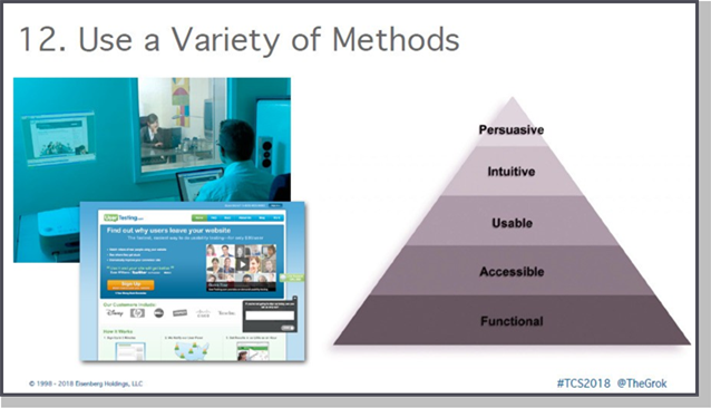
Now, if all you want to do is think about usability, usability is not everything. “If usability engineering designed a night club it would be clean, quiet, brightly lit, with lots of places to sit down, plenty of bartenders, menus written in 18-point Sans Serif, and instructions to find bathrooms. But, nobody would be there. They’d all be down the street at Coyote Ugly pouring beer on each other.” Thanks to Joel Spolsky for that analogy.
The top converting websites use a variety of methods to improve their conversion rates. Everything from journey analysis, to copy optimization, to creating more stories, to multi-variable testing, to personalization, to segmentation. Lots, and lots, and lots, and lots of methods.
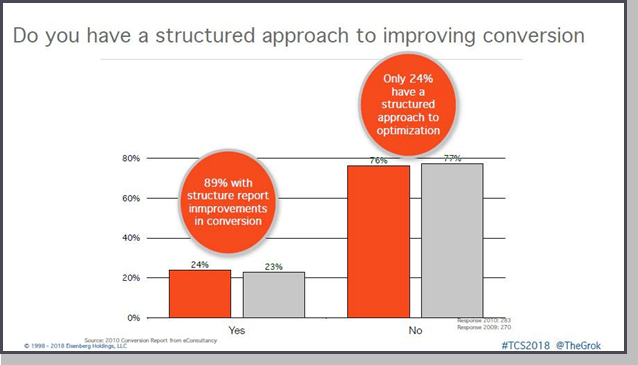
- Companies whose conversion rates have improved over the previous 12 months are using on average 26% more methods to improve conversion rates than those companies whose conversion rates have not
- Companies whose conversion rates have improved are using on average 50% more ways to segment their visitors and customers than those companies whose conversion rates have not improved
And the hard work pays off.
Secret #13 – They Use Persuasion Principles
Number 13, they use persuasion principals. If you want to learn more about this, you need to read stuff from Robert Cialdini. Read “Influence” and “Pre-Suasion.” I want to point out some of the great examples I’ve found over the years. My favorite is the steal the bag from eBags. They used to
put on the site how many people are currently shopping right now with how many were left. That’s just truly awesome.
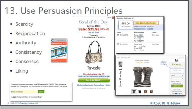
Of course, the airlines have been doing it for years. You know, people use social proof. But some of my other favorite examples, and I think this is where a lot of people are actually missing it, is taking it offline. This is your big opportunity to use reciprocity as a way to build your brand.
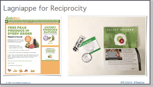
One company, FreshDirect would send these emails saying, “Hey, we’re going to send you free produce in-season. Just as a way to kind of keep you as a customer.” Or, Design Pickle, when you sign up, they would send you a little pamphlet in the mail with all kinds of stuff, and little stickers. That’s a way to get you into the community, to start connecting with you, and give you that extra little lagniappe so you feel that reciprocity with them. It’s simple – take it offline, please.
Just in case you don’t know the term:
Lagniappe – A small gift given a customer by a merchant at the time of a purchase (such as a 13th doughnut on purchase of a dozen). Or, more broadly, something given or obtained gratuitously or by way of good measure.
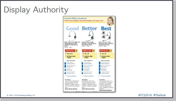
Display authority. When I come to your website I’m expecting you to be
the expert on the topic I’m trying to buy, I don’t have to be the expert. When I was trying to buy headphones, Headsets.com showed this is good, this is better, this is best. Now all I had to do was compare which features I wanted, and the price, and I can decide. I didn’t have to do all the hard work. Love ‘em. People will appreciate it.
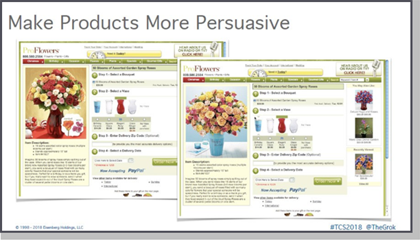
Make your products more persuasive. And if you ever get flowers, or buy flowers from ProFlowers.com, how do they come? Thrown in a box, that’s it. That’s not the way they look on the website, they look a lot prettier.
Secret #14 – They Don’t Do Slice-and-Dice Optimization
Websites with high conversion rates don’t do slice and dice optimization. Now we all know that story about Google going and testing millions of colors of blue until they got to the one they wanted. I worked with Google’s optimization team for two years. They brought us in because they wanted a world class optimization team. Yes, it could do something on a large scale, but how many people have an endless supplies of traffic? How many of you have endless design resources? Okay, conversation over. So don’t do this, right?
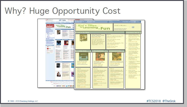
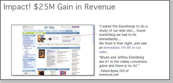
Simple example, Overstock was a client of ours. They came to us because they basically had been throwing endless resources trying to come up with something that worked. This is their number two traffic page, other than their homepage – their movie page, at the time. They had over a 60% abandonment rate just from this page, second most visited page on their site. They knew there was huge opportunity here but couldn’t get people to stick around and take action.
A team of seven statisticians, two multi-variable testing tools, and the way they would approach trying to fix this problem is literally taking every single section of the page, cutting it up, moving it around. Try different things and see if they can solve the problem. This didn’t move the needle.
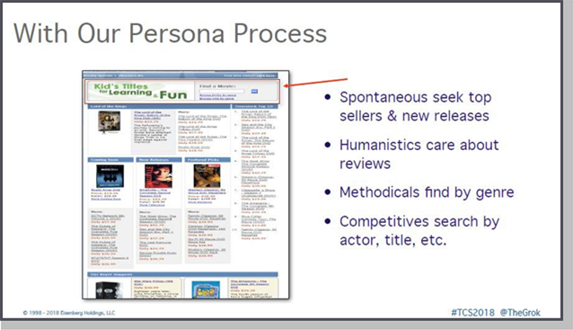
We came to them and said, “Okay, let’s use our persona approach.” Remember those four personality types in terms of how they look for information on websites? So we look at the page and say, “Spontaneous people – what do they look for? Top sellers and new releases. Do we see that on the page? Yes, check, leave them alone.”
Humanistics, they care about reviews. Actually, Overstock has hundreds of thousands of reviews, but not on the page. But it would involve bringing in IT, so we said, “Well, we can wait on that. We’ll test that later.”
Methodicals, they like to search by genre, which you can actually do on the page. It’s that tiny little link under the search bar, but you could do it. We could fix that later. Remember, methodical’s would look all over, so they’d find it.
But the Competitive’s, they search by actor and title. What happened to the Competitive’s when they got to this page? What did they see? Kid’s titles for
learning and fun. What did they think they were searching for? Kid’s titles. We replaced that one graphic. That one graphic was worth over 25 million dollars to Patrick Byrne, one graphic. How many of you want a 25-million-dollar graphic? Can’t promise it, but, again, it just comes from understanding your personas.
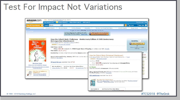
Amazon also tests for impact, right? They’re not changing tons of colors, tons of variations. They’re saying, “Hey, let’s see if we can make things stand out, price and availability, we’ll convert better. And if it does then they can release it.”
Let me give you the process we’ve been using ever since we left our agency, to help companies improve their conversion rate. Very simple, any time you want to do a test you have to run it through the conversion trinity.
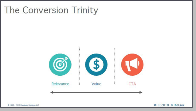
First, is it more relevant to your personas? Whatever you’re testing, are you trying to make it more relevant for them to understand how to buy? Two, are you increasing the value, or the expression of value, so you’re communicating more effectively? Or three, are you building confidence in order for them to take that action, to click a button, to shop, whatever it is? Very simple. The best test: do all three. Simple enough.
Secret #15 – They Engage People with Info-Tainment
Great converting websites engage people with info-tainment. My friends from Jigsaw Health sell magnesium supplements. Do you know what magnesium is really good for doing if you take the wrong magnesium supplement? You just may experience a laxative effect or symptoms like diarrhea, nausea or cramping. Not the most exciting thing to talk about, right?
Hence, that’s why they sell and show off their TP2000, because if you take too much magnesium … yeah.
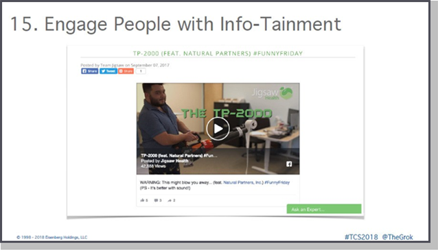
Jigsaw Health knew this, and when came up with an entertaining way to provide information about their TP2000 supplement. They took toilet paper and a leaf blower, and they toilet papered their office, and of course, got a ton of volume. And they’ve been doing these video series on and on. They did some amazing things, but they’ve been growing with tremendous amount of video content. We’ve heard it over and over again.
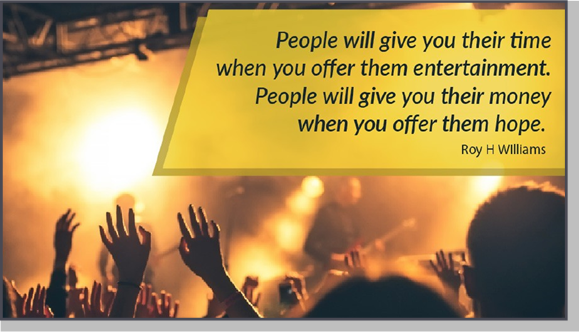
My mentor and good friend, and co-author of Be Like Amazon, likes to say, “People give you their time when you offer them entertainment. That’s why we create videos. But people give you their money when you offer them hope.” This is really, really, really important. There’s a number of ways that you can do that, kind of make it a little bit easier. And part of the hope is that you’re going to solve their problem, right? It’s really simple.
I have a 12-year-old who’s obsessed with baseball, and one of favorite examples online comes from doing searches with him. Of course, we’re looking at the new CAT 7, and he’s got bat envy right now. The way they create their videos is a great example of how to do this. But of course, that’s sports.
But here’s some other kind of interesting video examples. This is one done by the company I’ve been advising for a few years called Sightly, and what they do is they’ll take your standard brand video content, and then they’ll basically put it in YouTube’s API. They’ll personalize every video to specific location, so that now they can target you if you’re around here for a specific Sports Clips place. As opposed to just the generic thing. So again, understand the personas, using data to be more effective in video. So definitely check them out.
Another great example is Videoo. You guys have probably seen their stuff, and you didn’t even know about it. What they do, which is so cool, is they’ll take text reviews, and videos, and pictures from social media, and they give you a whole interface. And they’ll create these movies for you. So if you don’t have to have a tremendous amount of assets, they let the artificial intelligence build the stories. Simple text reviews into video.
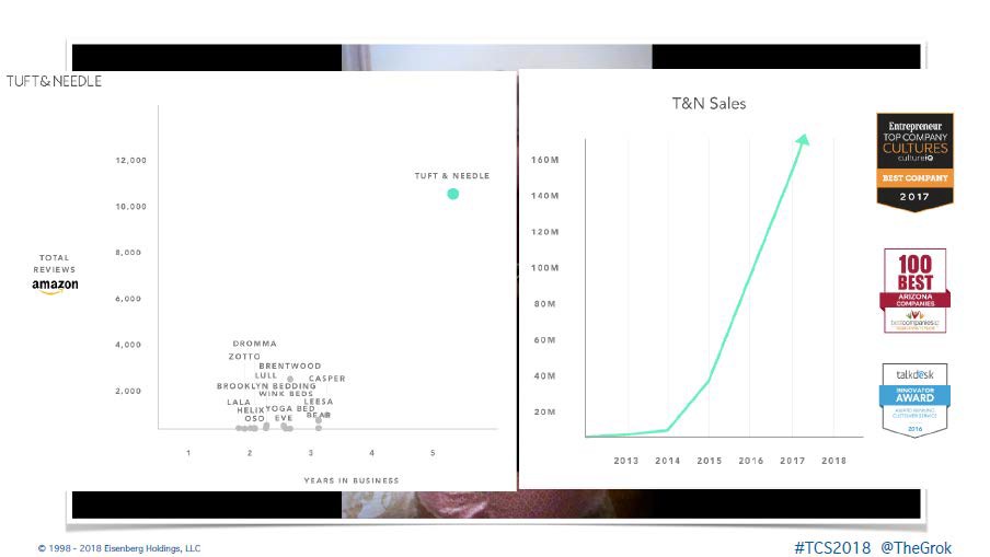
The chart above shows the impact using Videoo had for a company called Tuft & Needle. By repurposing content into video, their growth has just been astronomical. One of the founders of Videoo actually helped on the team.
And you can see, positioning wise, they’re the fastest growing by far. And they definitely attribute Videoo as one of their secret formulas.
Secret #16 – They Engage Across Channels, Keeping Money in the List
Number 16, they engage across channels, because the money’s always been in the list. We still need to collect email addresses, period, at the end of the day. We were doing a walkthrough with a client of ours, and as they were going through the process we came across their website.
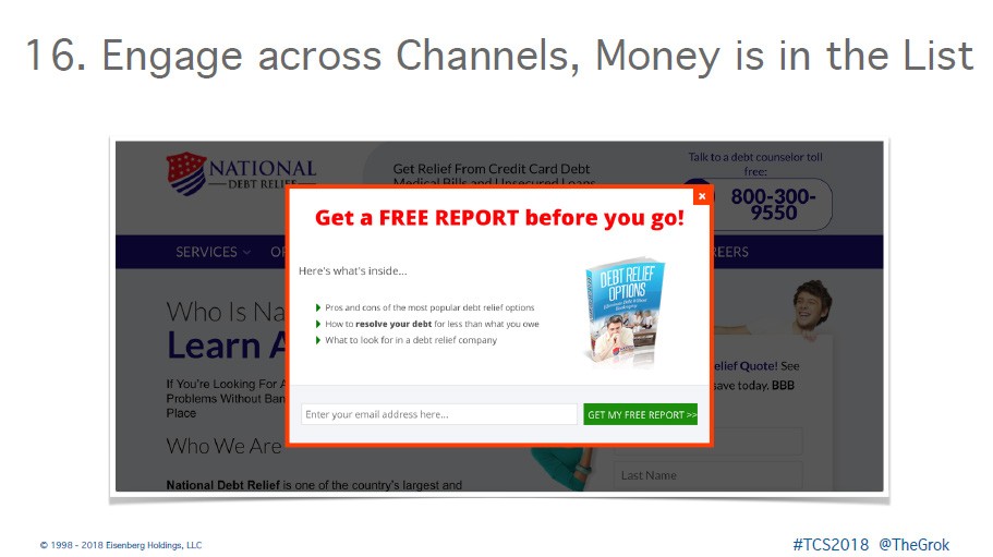
What we did is we actually had them step into the shoes of their personas and walk through their competitor’s websites. And they came across this website, and they were getting ready to exit because the site sucked. Even though they spend a lot of money in advertising, all that. But they came up with this free report. And we asked, would the personas download this? And of course, everyone’s answer was yes.
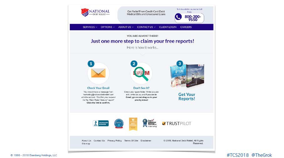
So, they filled this out, www.getwsodo.com part. The spectacular part is what they did on the thank you page. The thank you page is your
most valuable real estate on every single website, which most people neglect. Look at what they do to make sure that you actually open up that asset. They straight out tell you to check your email and if it’s not there, make sure it didn’t end up in the spam folder. It’s a great way to use a thank you page.
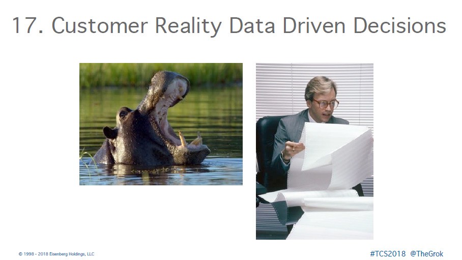
Secret #17 – They Make Customer Reality Data-driven Decisions
Next, they make decisions based on customer reality data. Customer reality data is what matters to the customer. Not making short term decisions, but looking at things from their point of view, and understanding what they’re trying to do. Not making decisions based on the HIPPO. You know what the HIPPO is? Highest Paid Person’s Opinion. And not just relying on data.
There is and art and science to this.
What you need to do when you’re working with web analytics is create a to- do list. That’s the only job of web analytics, and you can do this as a whole team. Gather information and make a war plan. What happens if traffic from Facebook drops by 20%? What are we supposed to do? So the whole team knows exactly what has to be looked at, checked out, what might have happened. There’s a whole plan. You’re not at the last minute scrambling to do this. That’s getting your operations in order, in order to succeed.
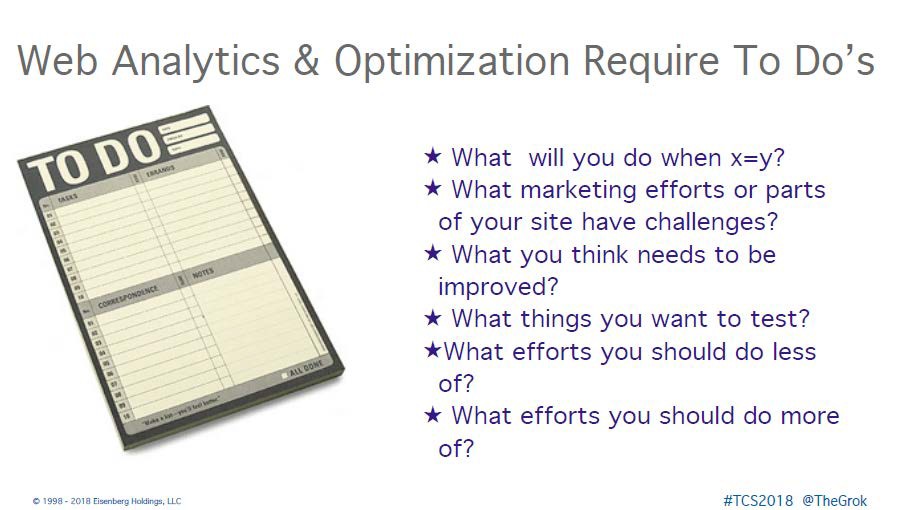
What marketing efforts are part of these sites and still have challenges? What do you think needs to improve? What thing do you want to test? What efforts should you do more of? What should you do less of? That’s the goal of analytics. If you’re not getting a report that gives you this out of it, you’re wasting your time with analytics.
Secret #18 – They Use Faith-based Innovation
I’ve talked a lot about testing, but sometimes it comes down to just trying things based upon faith – faith that what you are doing will have a positive impact on conversions. I will have to admit, I have a hard time with this. Back when I was first getting started and was studying Amazon and trying to understand them from the outside, I didn’t really get what they were doing. I saw all the different variations, thinking they were just doing A/B tests, that they were just experimenting with their “at the cart” area every time.
But now that I understand more about how Amazon thinks, I realize I was a fool. Every single time Amazon did one of these tests to the same part of their website, it wasn’t that they were trying to get peopleto convert better. They were doing a faith-based initiative. They were
bringing something of extra value to you as a customer and hoping it didn’t tank their conversions.
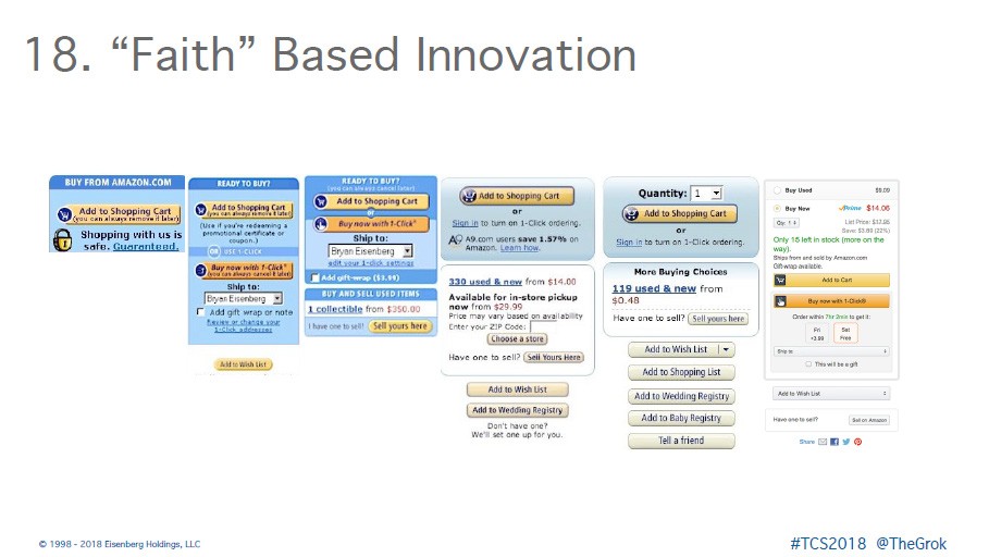
Let’s walk through different variations of the Amazon checkout as an example. From the first one, how many of you remember back in the early days when people would be scared to click a button on the web because they think they’d blow up the web? Yeah, that was my dad. So with the image of the lock, people perceived that shopping with less is safe. Do we think that was what Amazon was expecting? No, they probably thought the image would give the perception of safety, stuck it on there and thought, we can always remove it later.
But by the second version, they launched 1-click. So, they were hoping 1- click would be a huge thing for them. And of course, we know how big it ended up being, obviously – not! But they took a leap of faith that that would be a great thing for customers. They didn’t have to do the whole process. So, they launched that.
Then when they started selling used books, they had to shrink the button so it still stayed above the fold. Then they started offering A9. What did A9 become? Alexa. Every single one of these was just a faith-based initiative for some big innovation to improve their customer’s journey later on. It wasn’t just about random testing.
Secret #19 – They Budget for Experience
Number 19, they budget for experience. They spend money because they know optimization is part of their lifestyle. How many of you don’t have enough time to exercise? We all don’t have enough time to exercise. How many of you still prioritize it? That’s the balance. Great companies spend almost 30% of their time optimizing their past efforts. The average company spends less than 10

Secret #20 – They Utilize a System for Prioritization
Secret number 20, top converting websites utilize a system for prioritization. One of the best things about working with clients, everything from Dell, to Overstock, to Disney, to Universal Studios, to companies that sell pig sperm online … yes, pig sperm … is that you get to learn from them.
When I did this work for Sam Decker at Dell we found a whole bunch of things wrong with the Dell website. We had given them a book this thick of all the things they could do to improve it. But one of the key things was this button on the product selection page. It was a configurator that said, “View
Your Options.” And we said, “No, people don’t necessarily want to view their options. Why not just like … help me choose?”
At that point Decker asked, “Well, what do we do next?” I am not going to go into details about the changes that were implemented in the website, but what I do want to share is something very valuable that I learned during this interaction.
Decker shared with me the system they were using to determine what things need to be prioritized, something I have gone on to write articles about. This is just a quick overview, for more information, check out this article I wrote: “3 Steps to Better Prioritization and Faster Execution.”
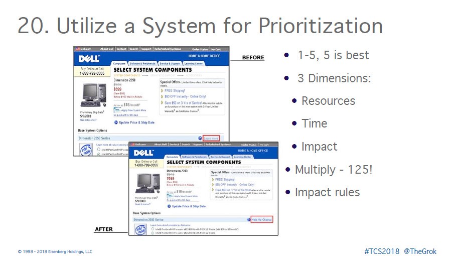
To prioritize what needed to be done, they create a spreadsheet and looked at resources, time, and impact, rating each of these on a scale of one to five. The rating signifies the priority of the item, based upon things you can implement right away.
- Do you have the resources? If you don’t have the resources you can’t do anything about it. It’s s If you have the resources, a lot of them, put them at a five. If you don’t have them, they’re a one.
- Time – how much time does it take to execute? And how much time does
it take to feel the impact?
- Impact – how big of a population can you actually affect? It’s not how great you’re going to do at a test because no one If you get really good at it, you may want to add a little bit of that. But how much of the audience can you impact?
And then you multiply those things within each component, come up with a score. 125 is the highest. The category with the highest number should be given the highest priority. The higher the score within each component, the higher priority it needs to be.
Secret #21 – They Operate Rapidly, Faster Really!
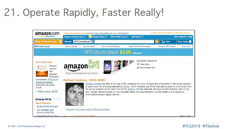
And finally, top converting websites operate exceptionally well. They have their sales, marketing, product, operations, everything in alignment. They are streamlining, they’re humming along. For example, the day Michael Jackson passed away, Amazon reconfigured their store within two hours. By the way, they have a two-hour window of Q&A from the time they push a button until it goes there. How many of you can’t call a meeting in your company in two hours? They changed their store in that time frame.
Before we move on to some tips, let’s quickly review the 21 secrets of
top converting websites. The more of these you can implement into your website, the better results will be. They are:
- Compete on Values, Not Value
- Keep Brand Values in Brand Voice
- Obsess to Understand Customers
- Maintain Scent
- Understand Customer Buying Process
- Plan the Complete Journey
- Remove Friction and Overcome Objections
- Provide Point-of-Action Assurances
- Make Forms More Engaging
- Make Persuasive and Relevant Offers
- Look at things from different perspectives – think beyond crackvertising
- Use a Variety of Methods
- Use Persuasion Principles
- Don’t Do Slice-and-Dice Optimization
- Engage People with Info-tainment
- Engage Across Channels, Keeping Money in the List
- Make Customer Reality Data-driven Decisions
- Use Faith-based Innovation
- Budget for Experience
- Utilize a System for Prioritization
- Operate Rapidly, Faster Really!
What Can We Learn from Amazon?
This is what I’ve learned over the last 20 years. What Amazon has done is created a four pillars of success model that all of you can do. This is what we talk about in “Be Like Amazon”. They start with customer centricity. They build a culture of innovation. They focus on agility. And lastly, they continuously optimize. This is the secret to great growth, and to great companies, because it’s not like you’re going to get there overnight.
Now, I showed you that picture when I first started with my brother. If you had seen me when I left my agency, about 10 years ago, I was 277 pounds. I lost 100 pounds after that. And here’s what I learned – you don’t lose 100 pounds all at once. You know how you lose 100 pounds? One pound at a time.
You know how you have to increase your conversion rate? A little bit at
a time. You just have to get into it and commit to the process day, after day, after day. It’s compounding interest.
And here’s what I know about businesses today. Amazon is that big brown bear. And they’re coming after every industry and every business out there. Now think about this. If there are a bunch of us taking a hike in the forest and we see a bear – I don’t have to be the fastest person in the group, I just got to be faster than at least one of you. And here’s the thing, the companies that are winning today are the fast fish. They are beating the slow fish.
Become a great, fast fish.
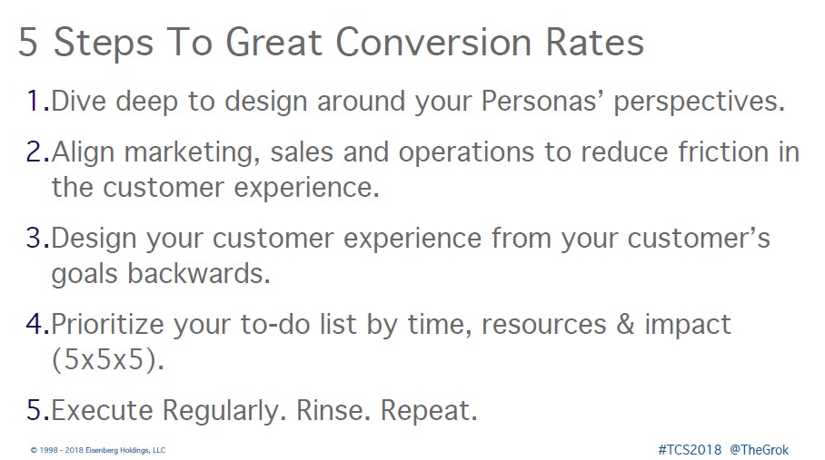
5 Steps to Great Conversion Rates
Let me leave you with five ways to think about all of this.
Number one: dive deep into designing around your personas’ perspectives. Understand what they want. It’s hard to do it when you’re inside your own business, but that’s really what you have to do. You have to obsess over that.
Number two: you need to align sales, marketing, operations, products, customer service to reduce the friction in the whole experience. Any place where there’s a disconnect, it’s going to kill your brand over time.
Number three: design your customer experience from your customer’s goal
backwards, like where I started. For you to achieve your goals, they have to achieve their goals first. Prioritize your to-do list, because we are increasingly busy every single day. So prioritization is critical.
Number four: prioritize your to-do list. Do this by time, resources and impact. Then score each of them (5x5x5).
Number five: execute. Regularly rinse and repeat. That’s it. Get great at execution, get a lot of outside resources to help you, and just get it done.
- Be Like Amazon: Even a Lemonade Stand Can Do It by Bryan Eisenberg, Jeffrey Eisenberg, and Roy H. Williams
- Persuasive Online Copywriting:
How to Take Your Words to the Bank by Bryan Eisenberg, Jeffrey Eisenberg, and Lisa T. Davis
- Call to Action: Secret Formulas to Improve Online Results by Bryan Eisenberg and Jeffrey Eisenberg
- Waiting for Your Cat to Bark?: Persuading Customers When They Ignore Marketing by Bryan Eisenberg, Jeffrey Eisenberg, and Lisa Davis
- bryaneisenberg.com
- buyerlegends.com
- sudo.ai
- combin.com
- acquisio.com
- sightly.com